The Theme Builder gives you a way to create your own theme for the site:
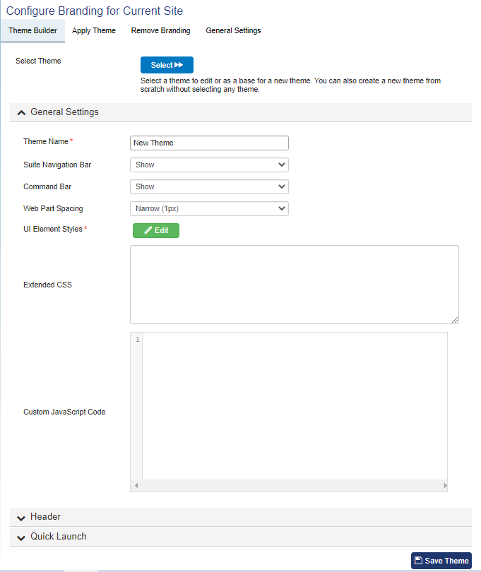
Pressing "Select" allows you to modify a theme that is already loaded onto the site. Otherwise, you can directly add CSS and/or JavaScript in the General Settings section.
General Settings
Skip to Header settings
Skip to Quick Launch settings
Theme Name: After you create your theme, the new theme will appear in the "Apply Theme" section and this is the name that will be shown there
Suite Navigation Bar: This is the bar across the top of your SharePoint site. You can choose to Show or Hide this by default. Expand means it will be expanded by default but also collapsible. Collapse means it will be collapsed by default but also expandable.
Command Bar: Has similar settings to Suite Navigation Bar. You can choose to Show or Hide this by default. Expand means it will be expanded by default but also collapsible. Collapse means it will be collapsed by default but also expandable.
Web Part Spacing: Auto-selects how far apart web parts appear on pages. Options are Narrow (1px), Medium (5px), and Default (defined by SharePoint)
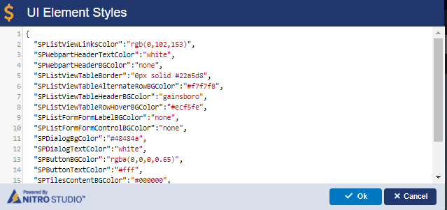
UI Element Styles: Brings up a screen where you can directly edit element styles that are in the CSS (Cascading Style Sheet) for the site.
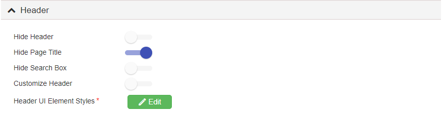
The header is at the top of the page:
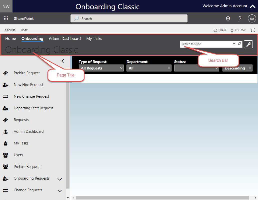
You can choose to hide the header entirely, or simply hide the page title and/or hide the search bar.
You can also customize the header with HTML as well as modify the Top Link Bar links:
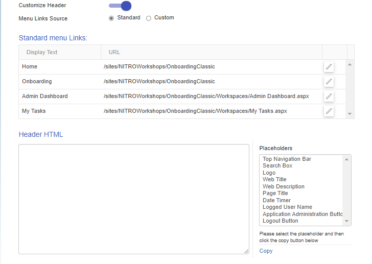
When the "Menu Links Source" setting is set to "Standard", it's going to pull the information from the Top Link Bar settings under Site Settings (standard SharePoint). However, you can customize your links.
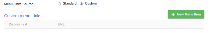
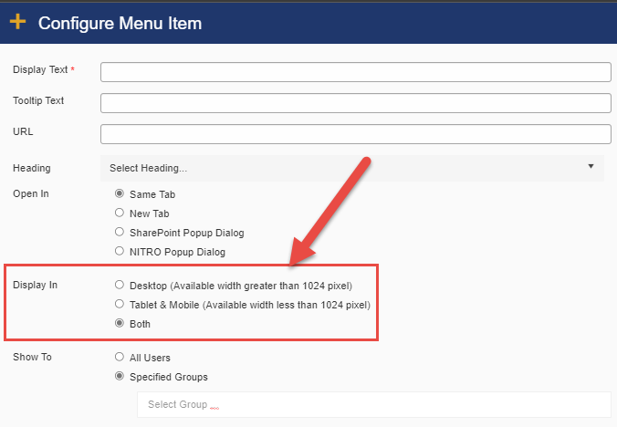
When you click on New Menu Item, you can create a new link, similar to the experience of creating a new link in SharePoint. However, one key difference is that you can security trim these links by specifying that they only be visible for certain SharePoint Groups.
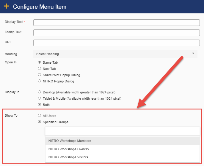
You can also set the link to display only in a Desktop browser, or only in Tablet/Mobile screen. Or you can show it in both:
By using the Header HTML section, you can ultimately customize the header in any way you see fit:
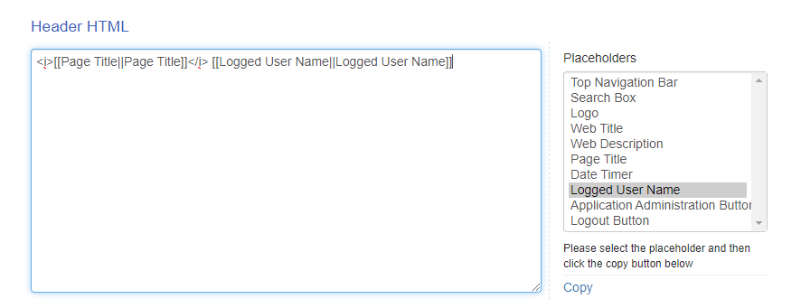
This can be especially useful if you hide the Suite Bar, which contains the logged in users name. As shown in the screenshot, you can insert the user's name into the header.
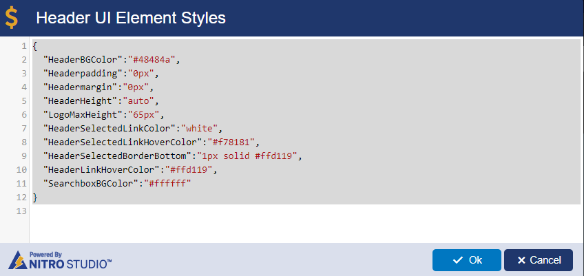
Finally, you can directly edit Header Element Styles by clicking on the edit button next to "Header UI Element Styles":
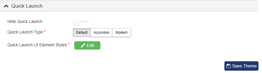
Under the Quick Launch header, you can choose to hide or show the Quick Launch. If you show it, you can use the Default, Accordion style, or Modern style Quick Launch. To learn more about these settings and what they look like, refer to the Quick Launch Styles section under Crow Canyon Themes.
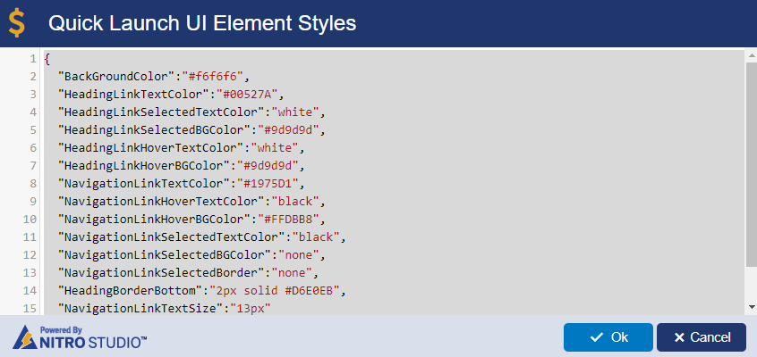
You can also directly edit the colors of the Quick Launch by clicking on the Edit button next to Quick Launch UI Element Styles: