List Views are typically used on either dashboard pages or home pages to present list data in the site or across multiple sites. This works well in conjunction with Dials, NITRO Reports, and Tiles for a look at the underlying data.
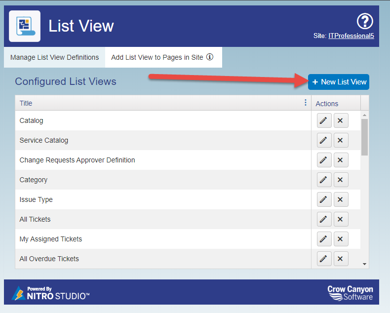
To configure a new List View to add to a Classic UI page, go to NITRO Studio and click on "List View". This will then show all NITRO List Views configured for the site for the Classic UI. If you are using the Modern UI, please see the Add View to Modern UI section first, and then come back here to go through the configuration options.
Either edit an existing List View or click on New List View...
...which brings you to this screen:
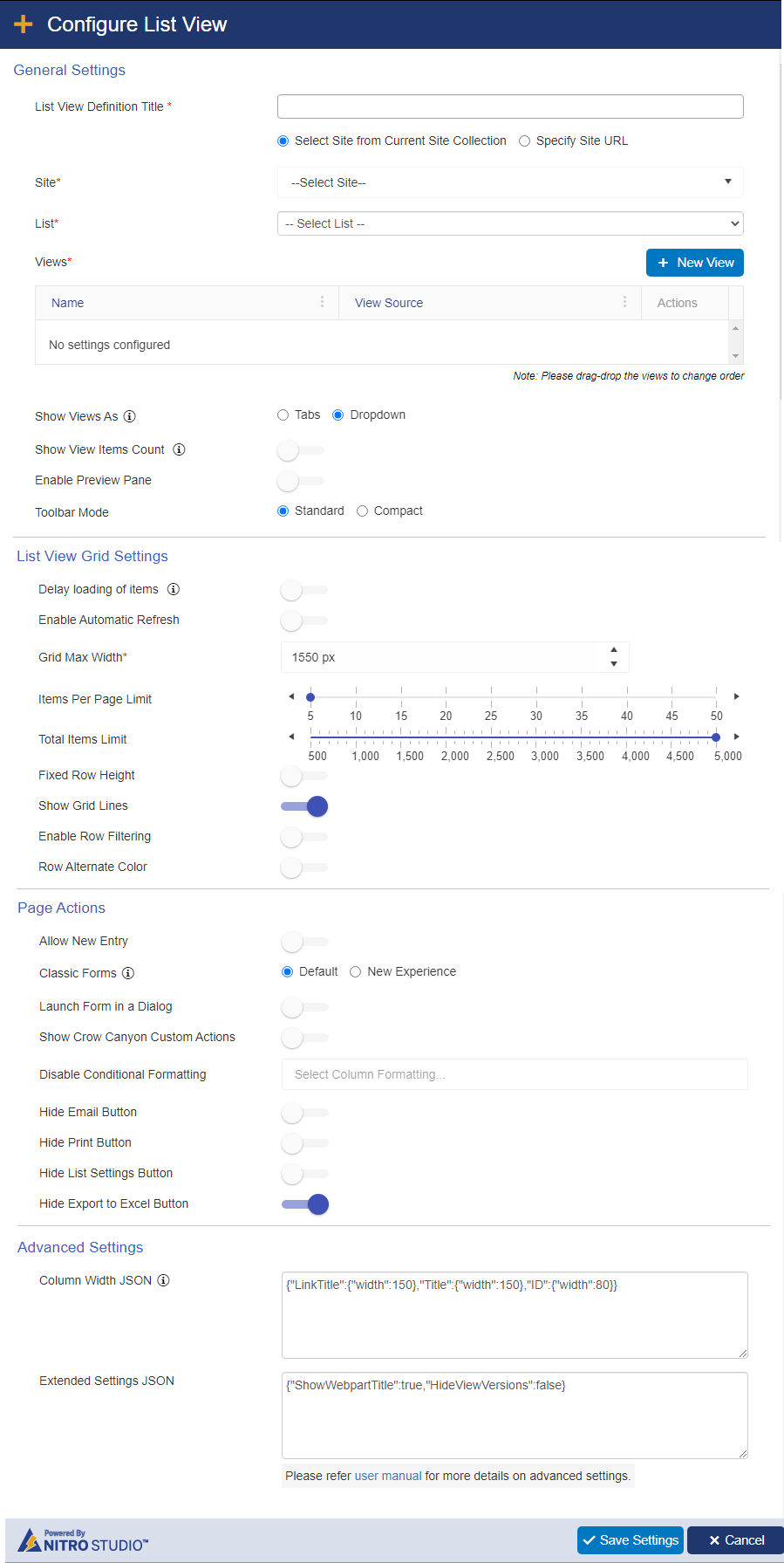
Site: Required. You can pull data from a list within the current Site, Site Collection, or Tenant/Web Application.
Select Site from Current Site Collection: Shows a drop down of all sites, including the root site, within the current Site collection
| Specify Site Url: Allows you to add your own URL to access a site in another Site Collection within the Tenant/Web Application. Note: the current logged in user will need at least read permissions on the selected site to set up this list view. |
List: Required. Shows all Lists within the selected site. This will be the list used for the list view.
Views: Required. Shows all views for the selected list. You must select at least one view for the web part. If you select more than one view, the List View web part will allow your users to change views by using the Tabs/Dropdown feature.
NEW VIEW button: Allows you to create a new view on the list while in the List View utility
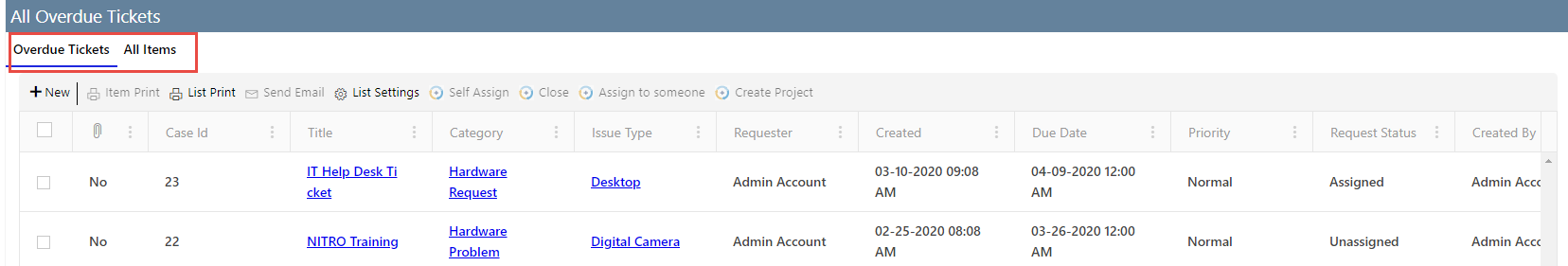
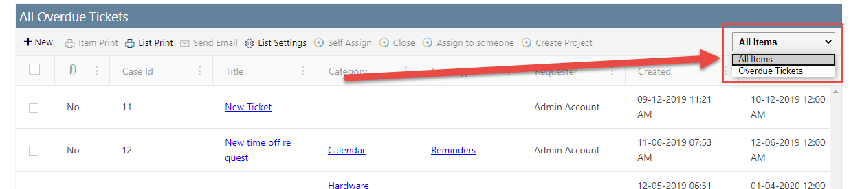
Show Views As: When selecting multiple Views, you can show the additional views using the Tabs or Dropdown feature:
Tabs: The active tab has a blue underline.
Dropdown:
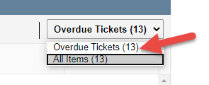
Show View Items Count: Shows the number of items in the selected view. This is useful for when you have multiple views configured.
Enable Preview Pane: Allows for showing a preview of the selected item. A "Preview" option will appear on the right of the web part:
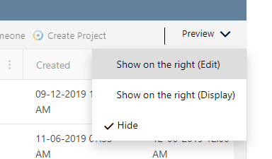
The options here will show the preview of the item in either Edit mode (i.e. the item will be editable) or Display mode (i.e. read-only) on the right of the web part. This selection is on a per user basis, so each user can select their own option.
Example:
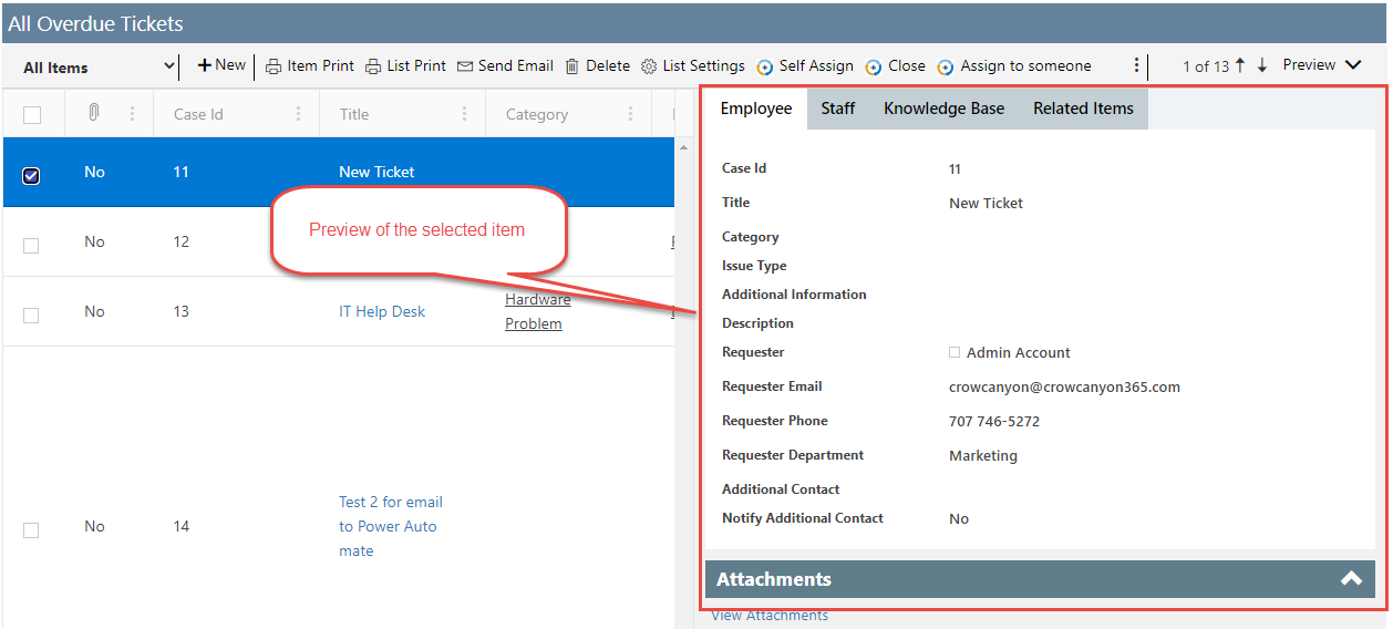
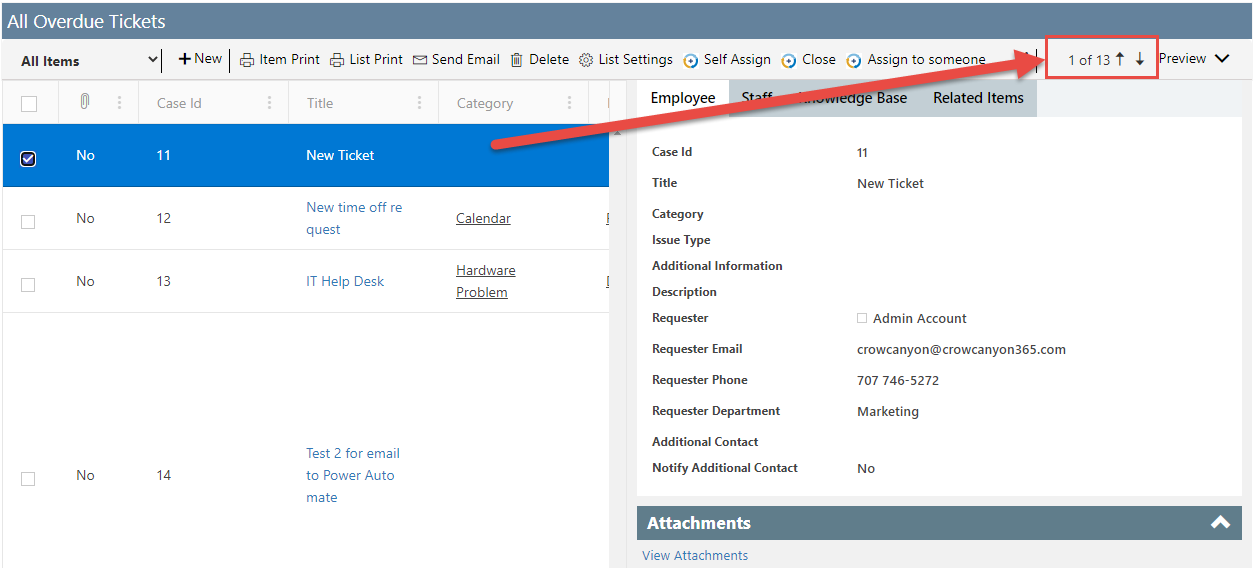
Also note that there is a way to move to the previous and next items in the list view from the preview pane. This allows for updating multiple items in sequence without needing to open item, edit, save, refresh, open next item, etc. Simply click the arrow up or down to get to the next item.
Toolbar mode: Has two options, Standard and Compact
List View Grid Settings
Delay loading of items: Allows for delaying the load of the web part to speed up the overall loading of the workspace page where this list view is added
Enable Automatic Refresh: Allows for the data to be refreshed periodically.
Grid Max Width: Max width of the list view on the web page. Default value is 1550px.
Items Per Page Limit: Determines how many items to show on a page before there is pagination.
Total Items Limit: Total items to return in the view. Max is 5000 as per Microsoft standards.
Fixed Row Height: Sets the row height to be consistent.
Show Grid Lines: Shows lines in between the items when there are multiple items in the view.
Enable Row Filtering: Allows you to filter items quickly by the value in a given column.
Row Alternate Color: Alternates between white and light blue for list views with multiple items.
Page Actions
Allow New Entry: Allows you to toggle the ability to add new items to the list on and off
Classic Forms: The "New Experience" will show the modern responsive tool bar when viewing a list item. "Default" will show the Classic UI ribbon.
Launch Form in Dialog: Let's you launch the form in a dialog box over the main web page. Otherwise the list item will open on a new browser tab.
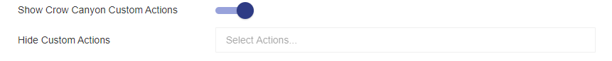
| Show Crow Canyon Custom Actions: If there are any Custom Actions configured for the list, they can appear in the ribbon with this option turned on. When this is enabled, the "Hide Custom Actions" box will appear. You can also choose to hide one or more Custom Actions from the list view. |
Disable List (Conditional) Formatting: You can choose one or more List (Conditional) Formatting settings to be disabled for this list view.
Hide Email Button: Hides the Crow Canyon Email button from the list view ribbon.
Hide Print Button: Hides the Crow Canyon Print button from the list view ribbon.
Hide List Settings Button: Hides the button that will take the user to the List Settings page of the list.
Hide Export to Excel Button: Hides the button that allows the user to export the list view data to Excel.
Advanced Settings
| Column Width JSON: Allows you to define the width of each column in the view using pixels. The default entries are {"LinkTitle":{"width":150},"Title":{"width":150},"ID":{"width":80}}. You can extend this to any or all columns with the list view by adding each list view and the corresponding |
Extend JSON Settings: Allows you to add additional custom JavaScript to the list view when it's rendered on the page.