Applies To: SharePoint Online (Modern)
Description
This article describes the steps to customize the site header using Crow Canyon Branding (Modern Sites).
This article has sample configuration for a customized header. As per your use case you can change the CSS and script code to get a different look and feel.
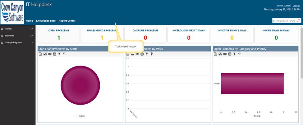
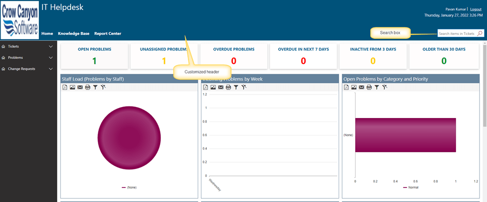
Modern site with customized header:
Detailed Steps:
- Configure the header settings and CSS in Crow Canyon Modern Branding
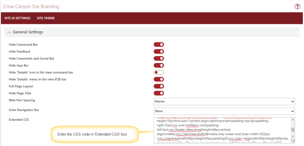
Navigate to Site Settings -> Crow Canyon Branding (Modern sites) under Site Administration and configure the custom CSS and Header HTML as shown below.
Custom CSS
.ccs_LogoArea{float:left;width:160px;height:160px;padding:0;margin:0;box-sizing:border-box;padding:5px}.ccs_Logo>img{width:150px;height:150px;display:block}.ccs_HeaderArea{margin-left:160px;height:160px;vertical-align:top;box-sizing:border-box;width:calc(100% - 160px)}.ccs_HeaderArea >.ccs_HeaderRightTableArea {display:table;width:100%;} .ccs_topHeader{height:115px;display:table-row}.ccs_Header_PageTitleArea{padding:5px;display:table-cell}.ccs_Header_PageTitleArea>.css_PortalHeading{font-size:32px;color:#fff;font-weight:400}.ccs_Header_PageTitleArea>.css_PortalHeadtingDescription{font-size:14px;height:60px;font-family:'Segoe UI',Tahoma,Helvetica,Sans-Serif;color:#fff}.ccs_Header_RightSideArea{display:table-cell;padding:2px}.ccs_Header_HomeLink{text-align:right;padding-right:20px;color:#fff}.ccs_Header_RightSideArea .ccs_Header_UserName{color:#fff; vertical-align: middle;}.ccs_Header_RightSideArea .ccs_Header_LogoutButton{vertical-align:middle;padding-left:5px;color:#fff}.ccs_Header_RightSideArea .ccs_Header_LogoutButton>a{color:#fff}.ccs_Header_RightSideArea .ccs_Header_TimeStamp{font-family:'Segoe UI',Tahoma,Helvetica,Sans-Serif;color:#fff;line-height:18px;font-size:11pt;text-align:right!important;padding-top:5px;padding-right:15px}.ms-core-listMenu-root{padding-left:5px}.ccs_Header_MenuArea{height:40px;vertical-align:middle}.ccs_Clear{clear:both}@media only screen and (max-width:1023px){.ccs_LogoArea{width:80px;height:80px;padding:0}.ccs_Logo>img{width:80px;height:80px;background-size:70px 70px}.ccs_HeaderArea{margin-left:80px;height:80px;width:calc(100% - 80px)}.ccs_topHeader{height:40px;max-height: 40px;overflow: hidden;display: block;}.ccs_Header_PageTitleArea{padding:5px;margin-right:50px}.ccs_Header_PageTitleArea>.css_PortalHeading{font-size:24px!important}.ccs_Header_PageTitleArea>.css_PortalHeadtingDescription{display:none}.ccs_Header_RightSideArea{display:none}}.ms-breadcrumb-top{margin:0}.s4-itm-selected > .ms-vb-imgFirstCell.ms-vb-imgFirstCell {background-color: #008000;border-right-color: #008000;}
Add above CSS in “Extended CSS” section under “General Settings”.
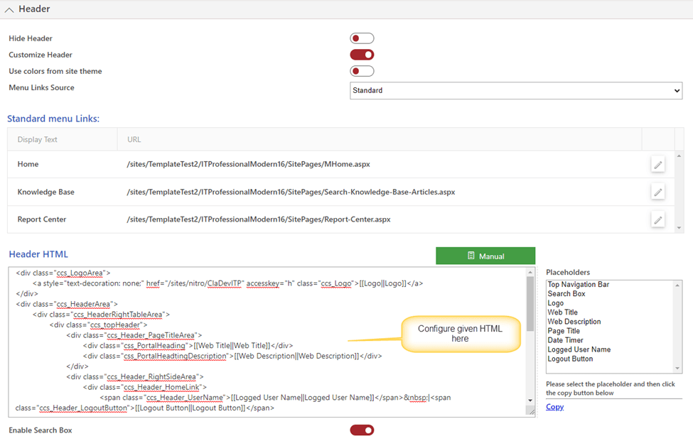
Header HTML
<div class="ccs_LogoArea"> <a style="text-decoration: none;" href="/sites/nitro/ClaDevITP" accesskey="h" class="ccs_Logo">[[Logo||Logo]]</a> </div> <div class="ccs_HeaderArea"> <div class="ccs_HeaderRightTableArea"> <div class="ccs_topHeader"> <div class="ccs_Header_PageTitleArea"> <div class="css_PortalHeading">[[Web Title||Web Title]]</div> <div class="css_PortalHeadtingDescription">[[Web Description||Web Description]]</div> </div> <div class="ccs_Header_RightSideArea"> <div class="ccs_Header_HomeLink"> <span class="ccs_Header_UserName">[[Logged User Name||Logged User Name]]</span> |<span class="ccs_Header_LogoutButton">[[Logout Button||Logout Button]]</span> </div> <div class="ccs_Header_TimeStamp">[[Date Timer||Date Timer]]</div> </div> </div> </div> <div class="ccs_HeaderRightTableArea"> <div style="display:table-row"> <div style="display:table-cell;vertical-align: top;"> <div class="ccs_Header_MenuArea">[[Top Navigation Bar||Top Navigation Bar]]</div> </div> <div style="display:table-cell;"> <div>[[Search Box||Search Box]]</div> </div> </div> </div> </div> <div class="ccs_Clear"/>
Add above HTML in “Header HTML” control under Header section as shown below:
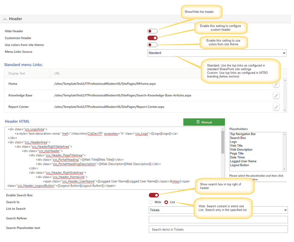
Header section
Sample output screenshot:
Customize header colors with CSS:
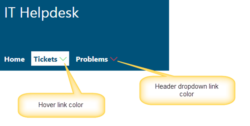
- To modify the header links dropdown icon and hover colors, add below CSS in “Extended CSS” in General Setting section in Modern branding
Custom CSS:
#CCSCustomizedHeaderRow li.static > .ccs-core-listMenu-item i {

     color: ##HeaderSelectedLinkDropdownIconColor## !important;

     font-size: 12pt !important;

}

 #CCSCustomizedHeaderRow li.static > .ccs-core-listMenu-item i:hover, #CCSCustomizedHeaderRow li.static > .ccs-core-listMenu-item:hover i {

     color: ##HeaderLinkHoverColor## !important;

}
In above, replace ## HeaderSelectedLinkDropdownIconColor##, ##HeaderLinkHoverColor## with hexadecimal colors:
Example:
#CCSCustomizedHeaderRow li.static > .ccs-core-listMenu-item i {

     color: #e82217 !important;

     font-size: 12pt !important;

}

 #CCSCustomizedHeaderRow li.static > .ccs-core-listMenu-item i:hover, #CCSCustomizedHeaderRow li.static > .ccs-core-listMenu-item:hover i {

     color: #21db40 !important;

}
Output:
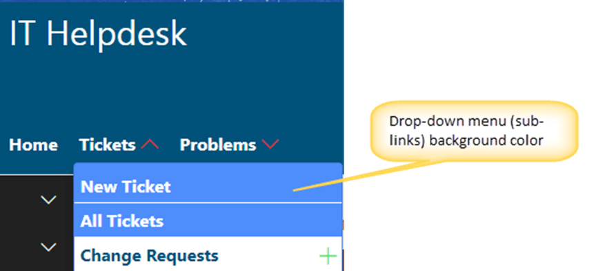
2. To modify the custom sub links background color, add below CSS in Extended CSS section
.CCSCustomSubMenu {

     background: ##HeaderBGColor## !important;

}
In above CSS, replace “##HeaderBGColor##” with hexadecimal color:
Example:
.CCSCustomSubMenu {

     background: #4e8efc !important;

}
Output:
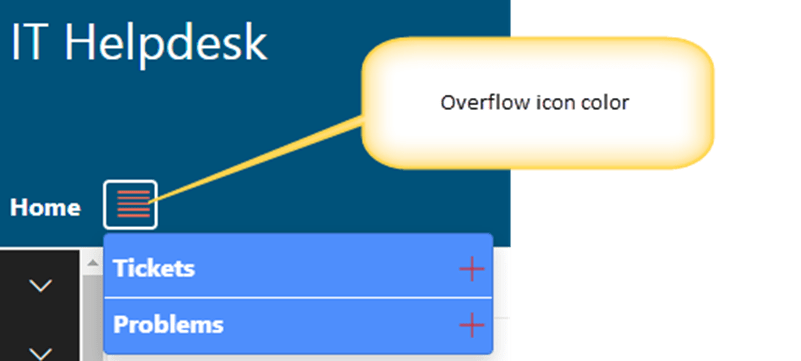
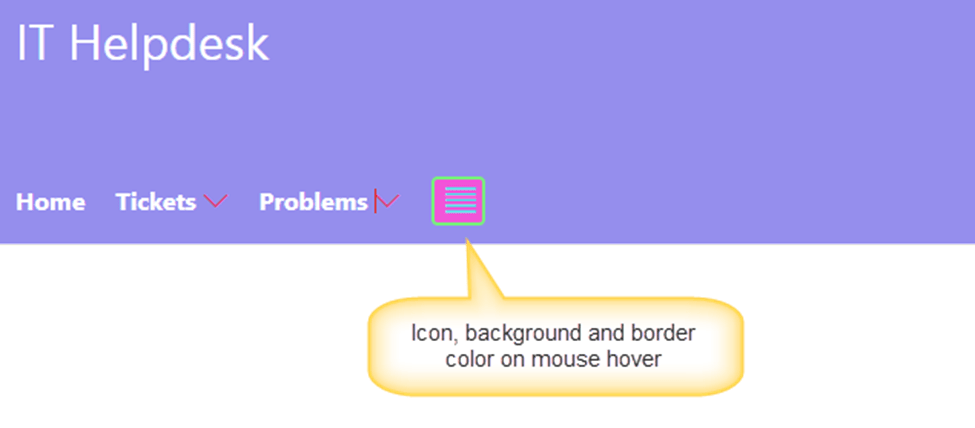
3. To modify the overflow header links buttons color, add below CSS.
li.CCSCustomTopNavMore > span.ms-Icon {

     color: ##HeaderSelectedLinkColor##;

}

 li.CCSCustomTopNavMore > span.ms-Icon:hover {

     color: ##HeaderLinkHoverColor##;

     background: ##HeaderLinkHoverBackgroundColor##;

     border-color: ##HeaderLinkHoverborderColor##;

}

 li.CCSCustomTopNavMore > span.ms-Icon {

     border: 2px solid ##HeaderSelectedLinkColor##;

}
In above custom CSS, replace below placeholders:
##HeaderSelectedLinkColor##: Overflow links button color
##HeaderLinkHoverColor##: hover color for overflow button
##HeaderLinkHoverBackgroundColor##: hover color for overflow button background
## HeaderLinkHoverborderColor ##: hover color for overflow button border
Ex:
li.CCSCustomTopNavMore > span.ms-Icon {

     color: #eb6f50;

}

 li.CCSCustomTopNavMore > span.ms-Icon:hover {

     color: #34e5eb;

     background: #f255d8;

     border-color: #77f27b;

}

 li.CCSCustomTopNavMore > span.ms-Icon {

     border: 2px solid #ecf547;

}
Output:
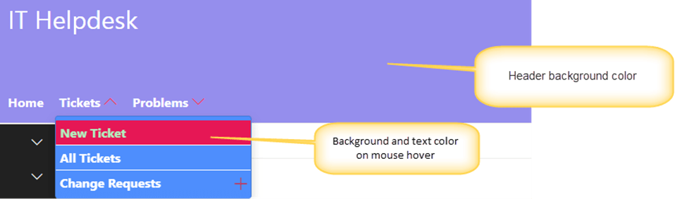
4. To modify the header background color, hover color and text color, add below CSS in “Extended CSS” section
Custom CSS:
div#CCSCustomizedHeaderRow {

     background: ##HeaderBGColor##;

}

 #CCSCustomizedHeaderRow ul li a:hover {

     background: ##HeaderSelectedLinkhoverColor##;

}

 #CCSCustomizedHeaderRow ul > li > a:hover .ccs-menu-item-text, #CCSCustomizedHeaderRow ul li a:hover .ccs-menu-item-text, #CCSCustomizedHeaderRow li a:hover i {

     color: ##HeaderLinkTextHoverColor## !important;

}
In above CSS, replace below placeholders with hexadecimal color
##HeaderBGColor##: Header background color
##HeaderSelectedLinkhoverColor##: Hover color for selected header link
##HeaderLinkTextHoverColor##: Hover color for selected header link text
Ex:
div#CCSCustomizedHeaderRow {

     background: #958eed;

}

 #CCSCustomizedHeaderRow ul li a:hover {

     background: #e61755;

}

 #CCSCustomizedHeaderRow ul > li > a:hover .ccs-menu-item-text, #CCSCustomizedHeaderRow ul li a:hover .ccs-menu-item-text, #CCSCustomizedHeaderRow li a:hover i {

     color: #b1f0bd !important;

}
Output: