Applies to: SharePoint Online
For additional settings related to this feature, please refer to Crow Canyon List View advanced settings – Crow Canyon Software Support
Description
Crow Canyon List View is a NITRO component that provides enhanced capabilities to view SharePoint list items. It also provides a host of features to do operations on list items. This article describes the advanced features of the NITRO list view component for use in various business applications.
Advanced Settings
Options available in ‘Extended Settings JSON’ in List view component.
- Hide command bar in list view web part.
- Apply background colour for command bar
- Vertical padding for header and footer
- Apply prefix in command bar
- Webpart header background colour, font size, weight, and font colour
- Whether columns are filterable
- Vertical separator between tabs
- NITRO List Settings in tabs
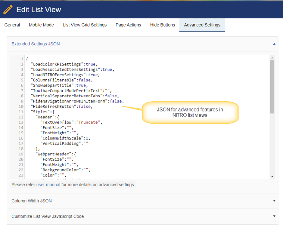
Note: Please ensure the JSON syntax for above settings. If syntax is invalid, then all settings will get cleared.
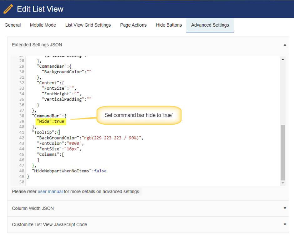
Hide command bar in list view webpart
By default, NITRO list view webpart will show the command bar and that will have different action buttons like New, Email, Custom Actions etc.
We can show or hide the command bar using ‘CommandBar’ property in ‘Extended Settings’.
Set “CommandBar” property ‘hide’ to ‘true’ as shown below to hide the command bar.
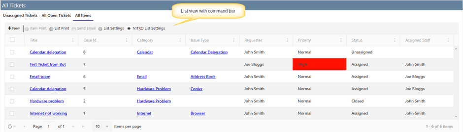
With command bar:
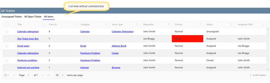
Without command bar:
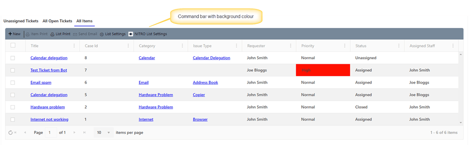
Apply background color for command bar:
We can apply background colour for ‘Command bar’ in ‘Extended Settings’ as shown below:
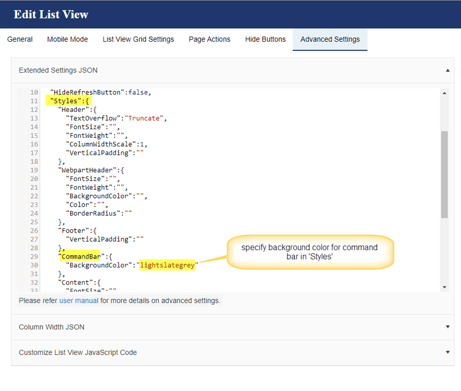
Example: “CommandBar”: {“BackgroundColor”:”lightslategrey”}
For html color names, refer to this article.
Vertical padding for header and footer
We can adjust the padding for ‘Header’ and ‘Footer’ in list view using ‘VerticalPadding’ settings in ‘Header’ and ‘Footer’ styles in ‘Extended Settings’.
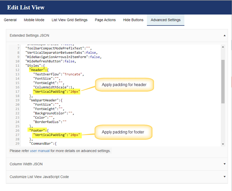
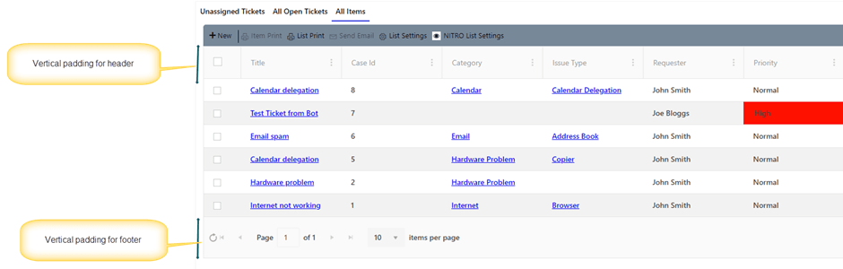
Sample output for ‘Header’ and ‘Footer’ after applying vertical padding. Compared to earlier images in this article, there is more space above and below the text in header and footer.
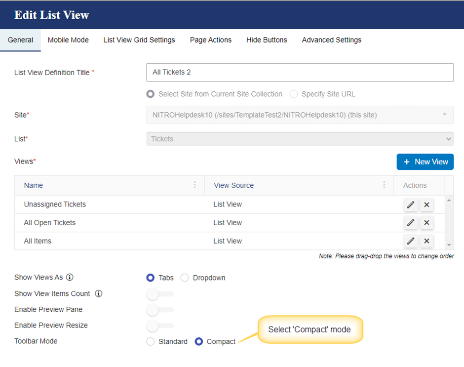
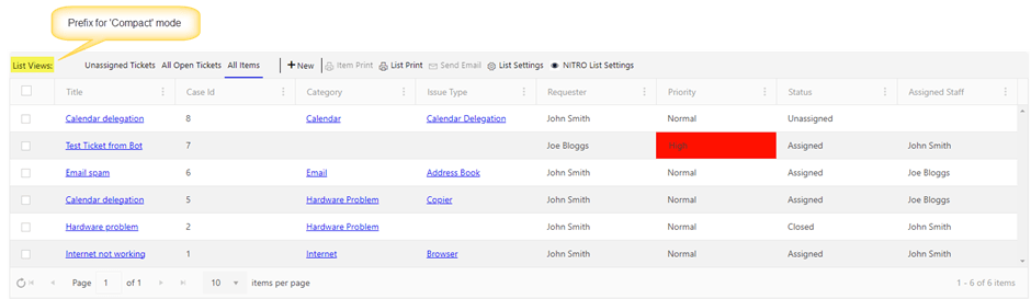
Apply prefix for Toolbar text:
This setting will be applied only when the list view ‘Toolbar Mode’ is selected as ‘Compact’ instead of ‘Standard’. In compact mode, list view tabs and command bar are merged in one line to save vertical space.
To select ‘Compact’ mode in toolbar, go to the site -> Site Settings -> Crow Canyon List View -> Create/Edit existing list view definition and select the ‘Compact’ mode as shown below:
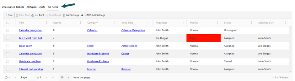
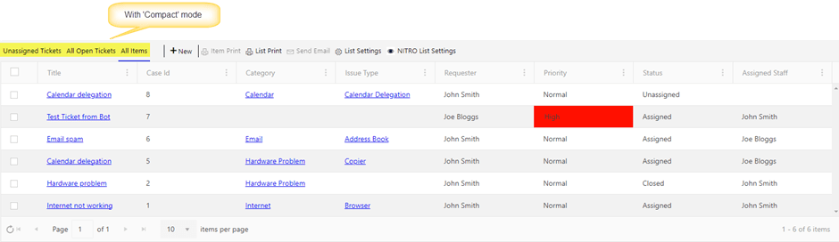
See the difference between ‘Standard’ and ‘Compact’ modes:
Standard:
Compact:
We can a text before the list views for ‘Toolbar’ in compact mode as shown below:
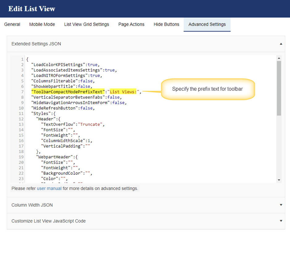
Sample output with prefix in toolbar:
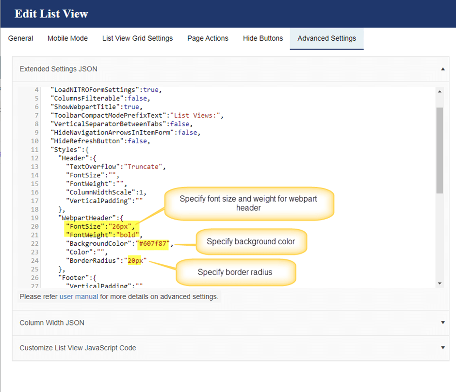
Webpart Header background color, font size, weight, and font color
Webpart Header background color, font size, weight, and font color
We can set the webpart header background color, font size, font weight and font color using ‘Extended Settings’ as shown below.
Refer below articles for font weight property and color picker:
https://www.w3schools.com/cssref/pr_font_weight.php
https://www.w3schools.com/colors/colors_picker.asp
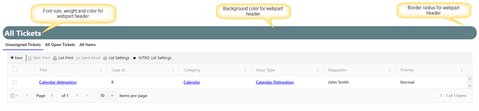
Sample output after applying webpart header properties:
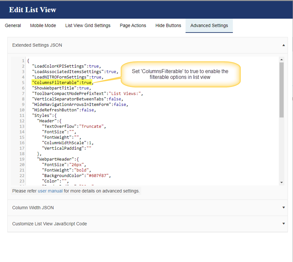
Columns Filterable
In NITRO list views, we can filter the items by selecting the operator and specifying the column value as shown below:
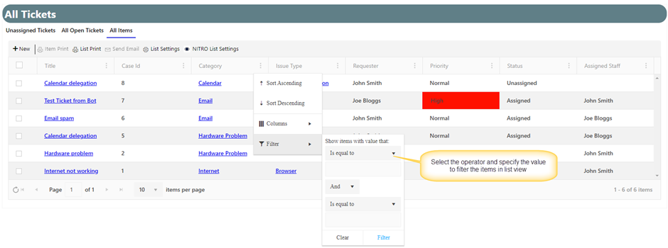
‘Column Filterable’ option in NITRO list view will provide the flexibility to select the filterable value like SharePoint list view. It shows the options to filter as per values in the items in list view. This makes it easy for user to do the filtering without having to type the value.
To enable this feature, go to the site -> Site Settings -> Crow Canyon List View -> Create/Edit existing list view -> Set ‘ColumnsFilterable’ to true as shown below.
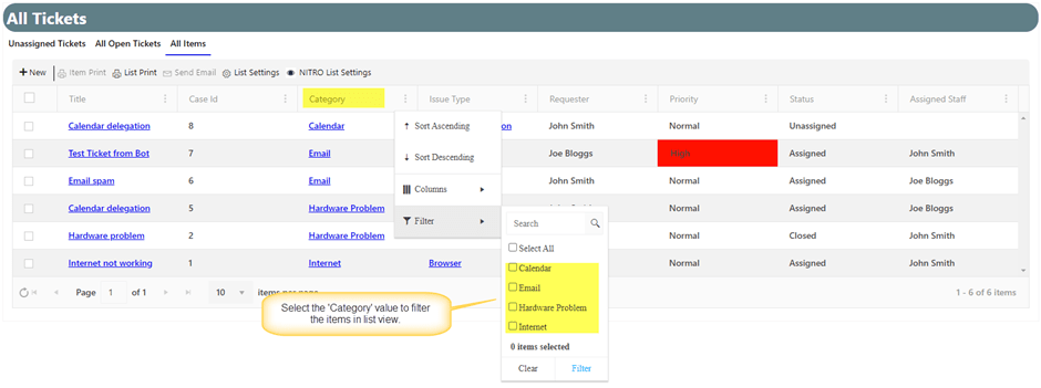
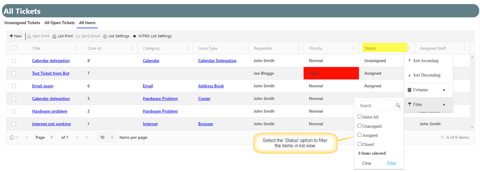
This will apply the filter option for all the columns in the list view.
Sample output:
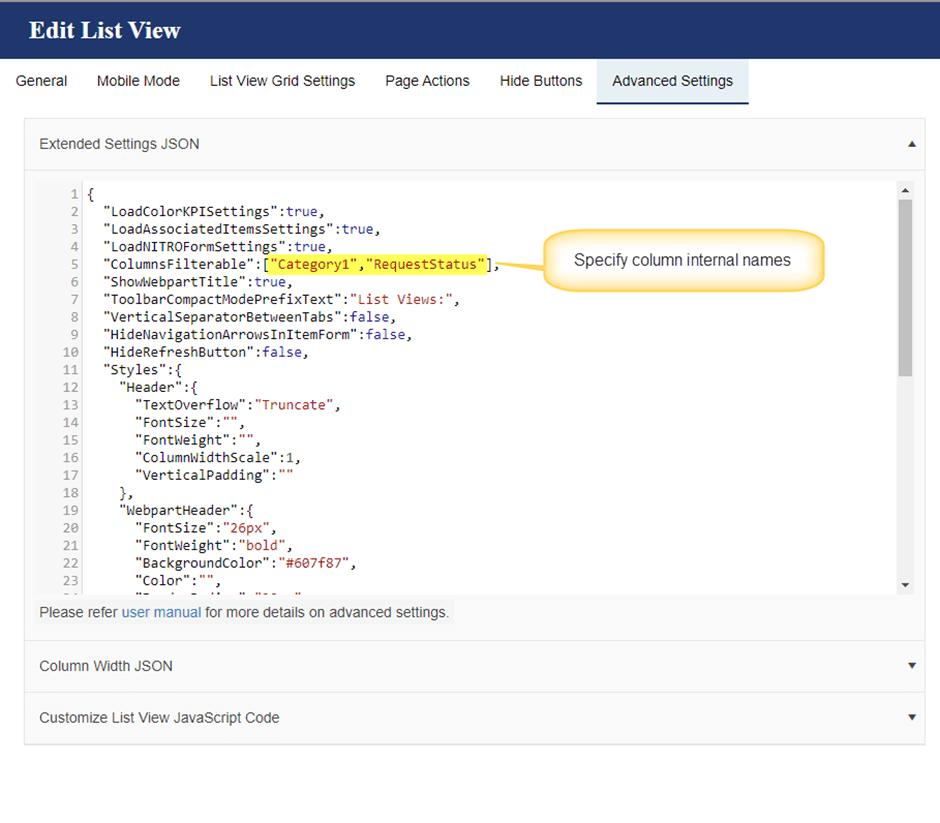
Note: To apply ‘Columns Filterable’ option only for specific columns, specify the column internal names in an array format as shown below:
‘ColumnsFilterable’: [“Category1″,”RequestStatus”]
To know the column internal names, refer to this article.
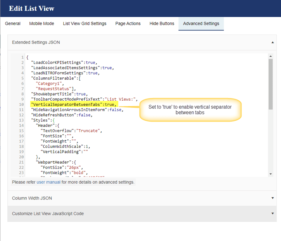
Vertical separator between tabs
In NITRO list views, we can show the list views as ‘Tabs’ and ‘Dropdown’ in case of multiple list views.
This setting is applied only when we select ‘Tabs’ option in ‘Show Views As’.
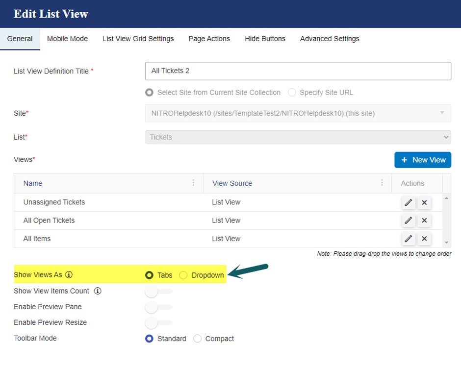
To enable the vertical separator for tabs, go to ‘Extended Settings’ in Advanced Settings and set the ‘VerticalSeparatorBetweenTabs’ to true as shown below:
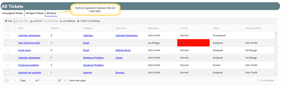
Sample output after applying vertical separator:
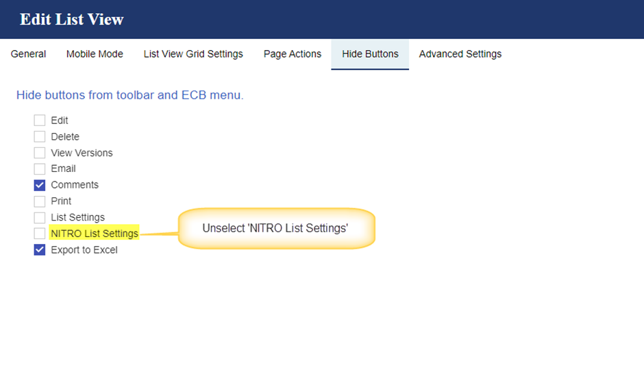
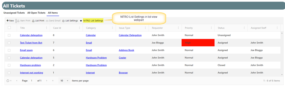
NITRO List Settings:
We can edit the NITRO list view settings directly using ‘NITRO List Settings’ button in the webpart instead of navigating to ‘Crow Canyon List View’ app settings page.
To show ‘NITRO List Settings’, go to the site -> Site Settings -> Crow Canyon List View -> Create or edit existing list view sett -> Navigate to ‘Hide Buttons’ tab -> Unselect the ‘NITRO List Settings’ as shown below:
Note: This button will be shown only for the users having ‘Manage web site’ permissions on the site.