Applies to: Crow Canyon NITRO activated sites in:
SharePoint Online and On-Premises 2013/2016/2019/SharePoint Server Subscription Edition
Description
List view placeholders can be added to the mail template of ‘Send Mail’ action in NITRO Workflows. By default, list view is printed in the form of a simple table in the email. It is possible to modify table properties by specifying JSON in the mail template.
Table properties, such as, table styles that includes background color, text alignment, border width and color; header that includes column styles, cell styles and row styles; rows and alternate rows that include row styles and cell styles, can be specified in ‘Advanced Settings JSON’.
Detailed steps
- Configure a NITRO Workflow with ‘Send Mail’ action and add list views to the mail body.
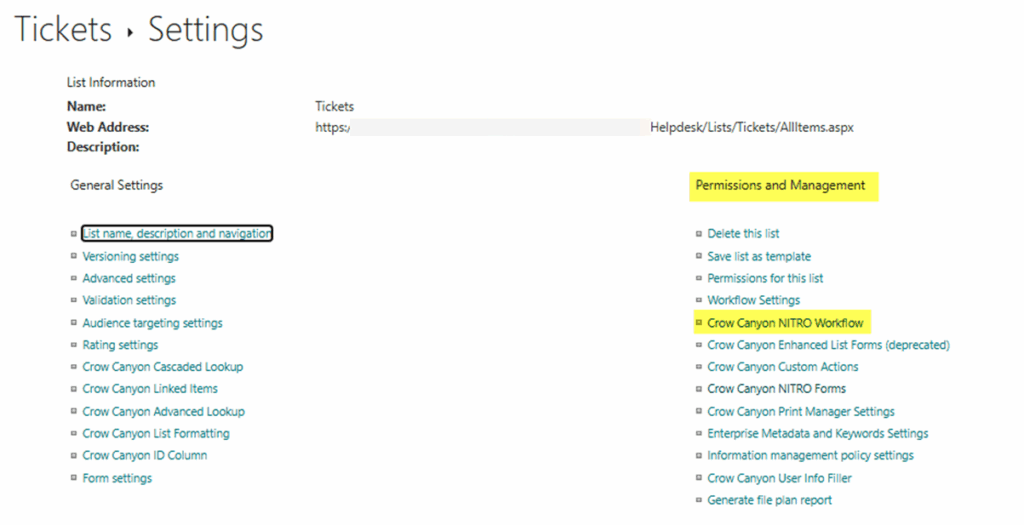
a) Navigate to the Tickets list -> List Settings -> Permissions and Management -> Crow Canyon NITRO Workflow as shown below:
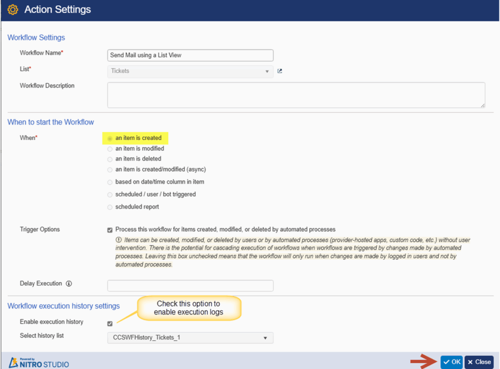
b) Click ‘New’ -> Select ‘Designer’ experience -> Event as ‘an item is created’ -> Click OK.

c) Enable execution history for the workflow from action settings.
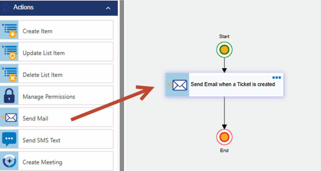
d) Configure ‘Send Mail’ action. Expand ‘Actions’ section -> Drag and drop a ‘Send Mail’ action onto the workflow canvas.
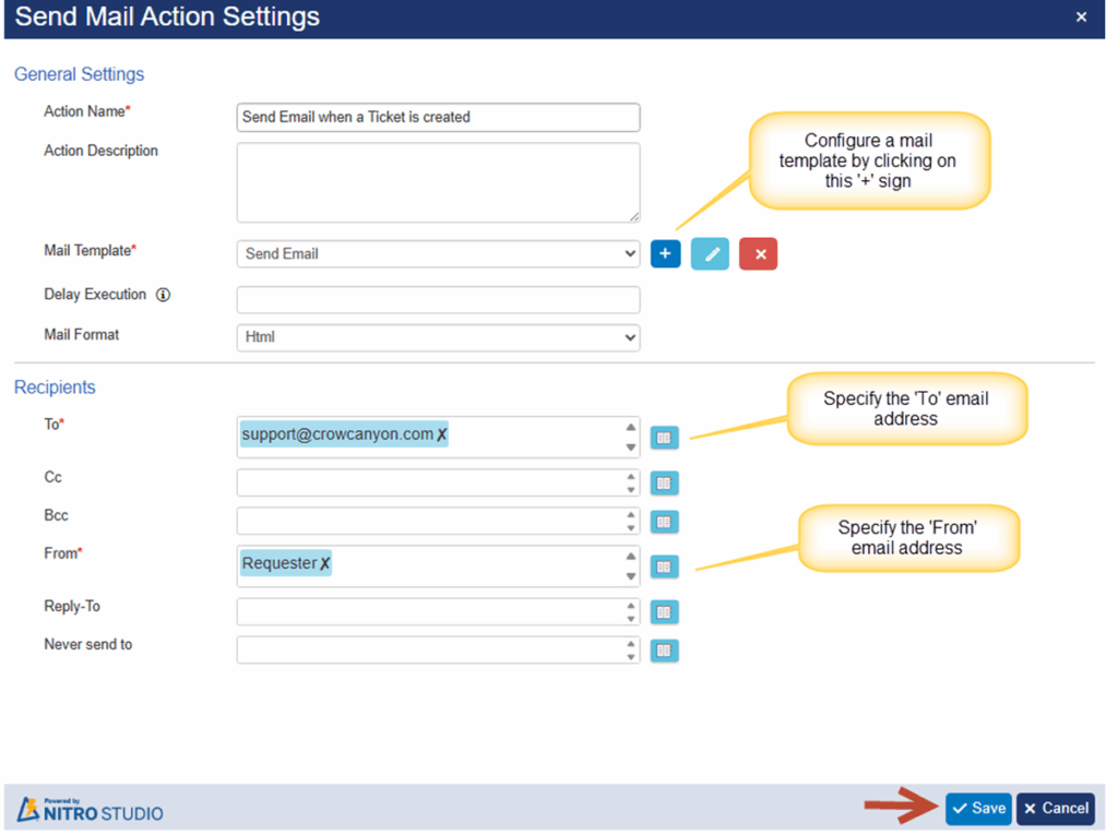
‘Send Mail’ action settings.
Sample mail template
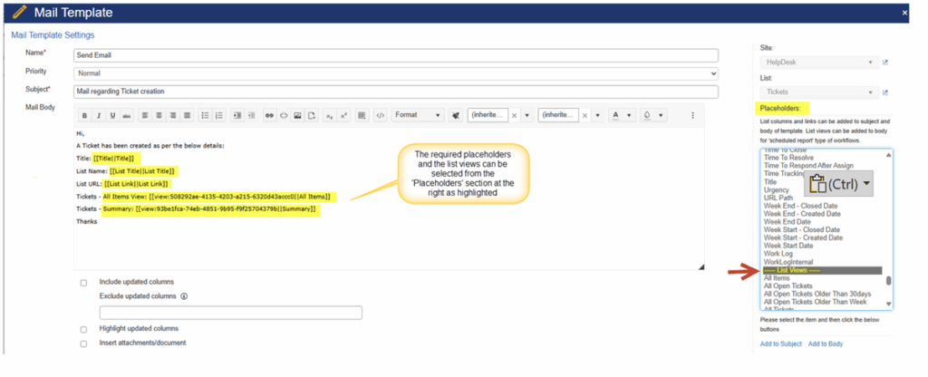
e) Configure table properties for the list views. Scroll down to the bottom of the mail template page and specify the ‘Advanced Settings JSON’ as show below:

JSON used in the above screenshot:
{
"ViewTable": {
"TableStyles": "background-color: #D6EEEE; width: 50%; text-align: left; border: 3px solid black;",
"Header": {
"RowStyles": "height: 70px;",
"CellStyles": "padding: 5px; height: 50px; vertical-align: bottom;",
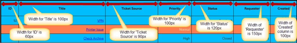
"ColumnStyles": {
"LinkTitle": "width:100px;",
"TicketSource": "width:90px;",
"ID": "width:60px;",
"Author": "width:100px;",
"Created": "width:100px;",
"Requester": "width:150px;",
"Priority1": "width:100px;",
"RequestStatus": "width:120px;"
}
},
"Rows": {
"RowStyles": "",
"CellStyles": "color:white;"
},
"AltRows": {
"RowStyles": "background-color: coral;",
"CellStyles": "color: wheat;"
}
}
}
(#D6EEEE is the code for Light greyish cyan color)
f) Publish the NITRO Workflow.
Sample output
Email:

Explanation of the different values used in JSON:
- Values specified for ‘TableStyles’:
- background-color: #00bfff:
This value is used to specify background color of the table’s cells (#00bfff is Pure Blue).
- width: 100%:
This value is used to specify total width of the table displayed in the scheduled report.
- text-align: right:
This value can be used to align text inside the table cell to ‘right/left/centre’ as needed.
- border: 5px solid black:
This value is used to specify width and color of the table border.
Table header:

Values specified for table header:
- For “RowStyles”:
height: 70px:
This value sets the height of header row to 70 pixels.
- For “CellStyles”:
padding: 10px:
This value applies 10 pixels of padding inside each cell, creating space between the cell content and the cell border.
height: 50px:
This value sets the height of each cell to 50 pixels.
vertical-align: middle; text-align:center
This value is used to place the content in centre within the container (both horizontally and vertically).
Table row:

Column width:
Syntax: “Column internal name”: “width:100px;”
Example: “LinkTitle”: “width:100px;”
This value specifies width of the ‘Title’ column as 100 pixels to be displayed in the list view.
Note: Refer to this article to get internal name of a list column.
By default, the column width adjusts dynamically based on the cell contents. To prevent this behaviour and to enforce specified width of the column, ‘table-layout: fixed;’ can be specified in ‘TableStyles’ section as below:
“TableStyles”: “background-color: #00bfff; width: 100%; text-align: right; border: 5px solid black; table-layout: fixed;”Output:
Explanation for styling the rows individually:
"Rows": {
            "RowStyles": "background-color: #f0f0f0;",
            "CellStyles": "color:white;"
}
- “Rows”:
This key defines the style that will be applied to the regular (non-header, non-alternate) rows of the table.
“RowStyles”:
This property can be used to style the entire row, such as background color, border, or height.
Example:
“RowStyles”: “background-color: #f0f0f0;”,
background-color: #f0f0f0;
This value sets (#f0f0f0) light grey background color for each row.
“CellStyles”: “color: black;”
This value is used to specify text color of the cells. It is black in this example.
Sample output is shown below:

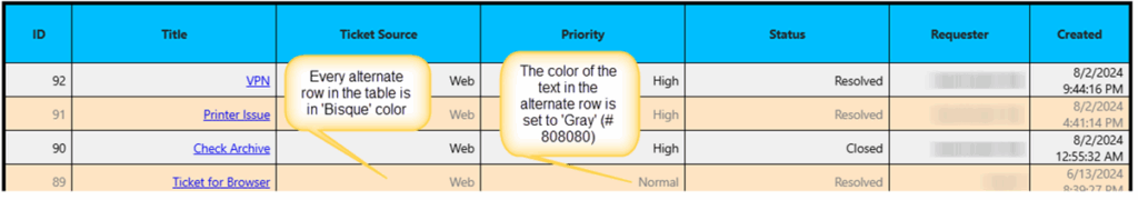
Styling the alternate rows:
"AltRows": {

            "RowStyles": "background-color: coral;",

            "CellStyles": "color: wheat;"

        }
- “AltRows”:
This is used to style the alternate rows in a table.
“RowStyles”: “background-color: #FFE4C4;”,
This specifies CSS applied to the entire row. In this case, it sets background color of the alternate rows to “Bisque (#FFE4C4).”
“CellStyles”: “color: #808080;”
This specifies CSS applied to the cells within alternate rows. Here, it sets text color of the cells in those rows to “grey” (#808080).
The output is as shown below: