NITRO Reports
We’ve added new options in our reporting tool to show the data in a more intuitive way. Here’s an example of each of the new options.
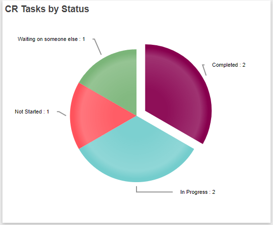
- Option to show count/value of each segment in pie chart/donut/column/bar etc.
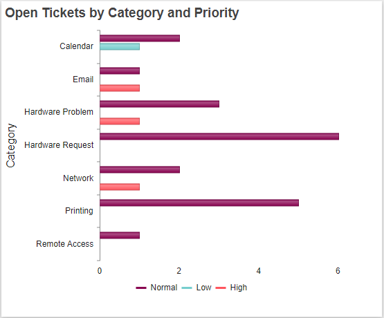
- Option to show/hide x-axis and y-axis labels (Example hiding the Row Header that says “Priority” at the bottom of the chart):
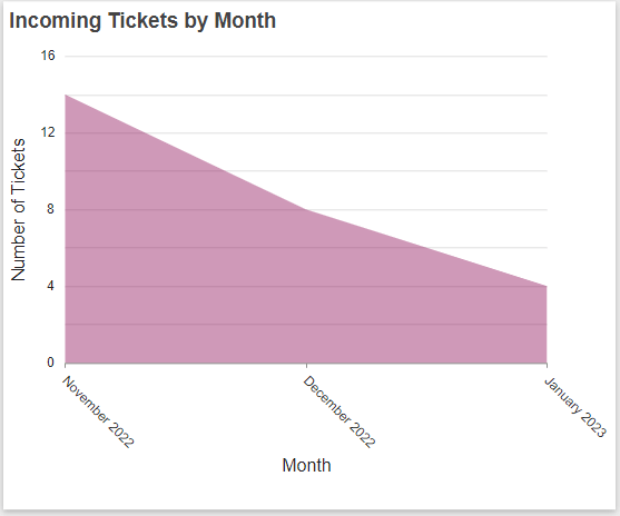
- Option to configure y-axis label when only x-axis is configured in the report and vice-versa. (Example showing “Number of Tickets” as the y-axis label when only x-axis is configured)
- Do not show decimal values for count of items in y-axis. (Same example as above bullet point showing that the numbers on the left don’t have any decimals)
- Multiple changes in tabular reports for display of rows, columns and headers.
We will be releasing more reporting changes in upcoming releases of NITRO Studio!